
Poster Card
卡套里的收藏卡:2:3 封面带卡套反光、悬停扫光,倾斜的放送时间贴纸;卡片定高,标题最多两行;封面用 srcSet 保持锐利。
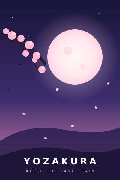
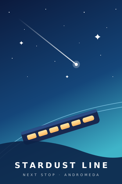
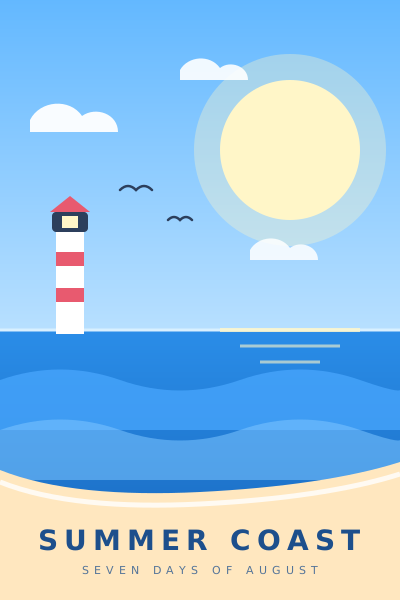

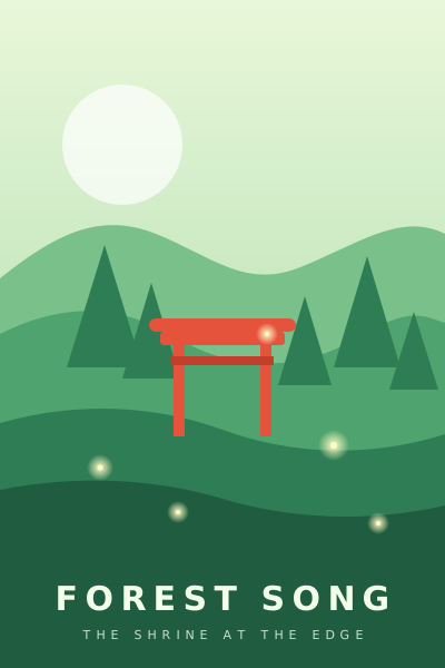


"use client"

import { RssIcon } from "lucide-react"
import { useState } from "react"

import {
  PosterCard,
  PosterCardAction,
  PosterCardRating,
  PosterCardSep,
  PosterCardStatus,
  PosterGrid,
} from "@/components/poster-card"
import { Badge } from "@/components/ui/badge"

const SHOWS = [
  { id: "yozakura", title: "夜樱终电", subtitle: "Yozakura: After the Last Train", time: "23:30", episode: "第 6 集", rating: 8.4, status: { tone: "ok" as const, word: "喵萌奶茶屋 已更新" } },
  { id: "stardust-line", title: "星屑列车", subtitle: "Stardust Line", time: "00:00", episode: "第 12 集", rating: 7.6, status: { tone: "next" as const, word: "下一集 · 20 分钟后" }, tone: "next" as const },
  { id: "summer-coast", title: "在那个夏天结束之前,我们一起去看海吧 第二季", subtitle: "Summer Coast: Seven Days of August", time: "01:05", episode: "第 12 集", rating: 7.9, status: { tone: "ok" as const, word: "绿茶字幕组 已更新" } },
  { id: "candy-magic", title: "糖果魔法少女 第二季", subtitle: "Candy Magic: Sugar Rush", time: "17:55", episode: "第 1 集", rating: null, status: { tone: "wait" as const, word: "待播出" } },
  { id: "forest-song", title: "森之歌:神社边缘的守护者", subtitle: "Forest Song", time: "22:00", episode: "第 3 集", rating: 6.9, status: { tone: "none" as const, word: "暂无种子" } },
  { id: "mecha-dawn", title: "机甲黎明 07", subtitle: "Mecha Dawn: Unit 07", time: "21:00", episode: "第 9 集", rating: 8.1, status: { tone: "ok" as const, word: "星空字幕组 已更新" } },
  { id: "snow-country", title: "雪国来信", subtitle: "Snow Country: A Letter for Spring", time: "00:30", episode: "第 4 集", rating: 8.8, status: { tone: "ok" as const, word: "北宇治字幕组 已更新" } },
  { id: "afterschool-band", title: "放课后屋顶乐队", subtitle: "Afterschool Band", time: "23:00", episode: "第 7 集", rating: 7.2, status: { tone: "run" as const, word: "放送中" }, tone: "airing" as const },
]

export default function PosterCardDemo() {
  const [subscribed, setSubscribed] = useState<Set<string>>(() => new Set(["yozakura", "snow-country"]))
  const toggle = (id: string) =>
    setSubscribed((current) => {
      const next = new Set(current)
      if (next.has(id)) next.delete(id)
      else next.add(id)
      return next
    })

  return (
    <PosterGrid>
      {SHOWS.map((show, index) => (
        <PosterCard
          key={show.id}
          href={`#${show.id}`}
          src={`/demo/covers/${show.id}.svg`}
          priority={index < 4}
          title={show.title}
          subtitle={show.subtitle}
          tone={show.tone}
          sticker={
            <Badge variant={show.tone ? "water" : "sticker"} className="anibt-num">
              {show.time}
            </Badge>
          }
          coverAction={
            <PosterCardAction
              aria-label={subscribed.has(show.id) ? `取消订阅 ${show.title}` : `订阅 ${show.title}`}
              pressed={subscribed.has(show.id)}
              onClick={() => toggle(show.id)}
            >
              <RssIcon />
            </PosterCardAction>
          }
          meta={
            <>
              <span className="anibt-num">{show.episode}</span>
              <PosterCardSep />
              <PosterCardRating value={show.rating} />
            </>
          }
          status={<PosterCardStatus tone={show.status.tone}>{show.status.word}</PosterCardStatus>}
        />
      ))}
    </PosterGrid>
  )
}
安装
npx shadcn@latest add @anibt/poster-card第一次用之前:在 components.json 里登记 @anibt,再单独运行一次 npx shadcn@latest add @anibt/theme(见快速开始)。只有单独安装主题时,CLI 才会把 shadcn 的标准颜色换成白樱 / 夜樱;随组件带进来的主题只补上 AniBT 自己的变量和配方。
手动安装
- 1. 先装主题组件只读
@anibt/theme的 token 和配方,没有主题就没有样子。npx shadcn@latest add @anibt/theme - 2. 安装依赖
npm install lucide-react - 3. 把下面的文件放进项目components/poster-card.tsx
import * as React from "react"
import { StarIcon } from "lucide-react"

import { cn } from "@/lib/utils"

/**
 * PosterCard — the AniBT 「贴纸手账」 collectible card: one show on a poster
 * wall (a timetable, a season, search results, a group's works).
 *
 * A paper face with the panel edge and 4px round a 2:3 cover. The cover sits
 * in a sleeve — a gloss across its top-left and a faint rim — and a sheen runs
 * across it under the pointer while the whole card lifts 4px and tips −0.6°.
 * A die-cut `sticker` (the airtime) is stuck on the cover's corner; corner
 * `badges` are square paper stickers; `coverAction` is the subscribe key in
 * the bottom-right corner.
 *
 * **Fixed height.** The title is at most two lines and always reserves two;
 * the full title rides in `title=`. The subtitle is one line, reserved even
 * when empty, and dropped on a narrow card; meta and status sit at the foot.
 * Every card in a row is the same height whatever it holds.
 *
 * **Sharp covers.** Pass `src` plus `srcSet` with real widths; the browser
 * picks from `sizes` × the device pixel ratio, so a 180px card on a 3× phone
 * wants a 540w source. `sizes` defaults to `POSTER_SIZES`, which matches
 * `PosterGrid`'s 3 / 4 / 6 / 8 columns — a card outside `PosterGrid` passes
 * its own. `posterSrcSet` builds the list from a
 * URL-per-width function. Or pass your own element (`next/image`) as `image`.
 *
 * **Links.** `href` (or `link={<Link href="…" />}` for a router) makes the
 * title a link stretched over the whole card, so the card opens the show
 * while `coverAction` stays a separate control above it.
 *
 * `tone="next" | "airing"` is the blue card (time is blue in A); `selected`
 * puts the pink ring on the open card.
 */

/** `sizes` for a cover in `PosterGrid` (3 / 4 / 6 / 8 columns). */
const POSTER_SIZES = "(min-width: 1440px) 176px, (min-width: 1024px) 17vw, (min-width: 600px) 25vw, 33vw"

/**
 * A `srcSet` from a URL-per-width function:
 * `posterSrcSet((w) => \`/covers/42.webp?w=${w}\`)` →
 * `/covers/42.webp?w=200 200w, …, /covers/42.webp?w=900 900w`.
 * The default widths cover a 3× phone and a 2× desktop wall.
 */
function posterSrcSet(urlForWidth: (width: number) => string, widths: readonly number[] = [200, 300, 400, 600, 900]) {
  return widths.map((width) => `${urlForWidth(width)} ${width}w`).join(", ")
}

type PosterCardProps = Omit<React.ComponentProps<"div">, "title"> & {
  /** Cover URL. */
  src?: string
  /** Width descriptors (`… 400w, … 600w`); see `posterSrcSet`. */
  srcSet?: string
  /**
   * The card's CSS width. Defaults to `POSTER_SIZES` when `srcSet` is set,
   * which is right only inside `PosterGrid`: a card anywhere else needs its
   * own (`"176px"`), or a phone picks a source too small for a 3× screen.
   */
  sizes?: string
  /** The title already names the show, so the cover is decorative by default. */
  alt?: string
  /** Above the fold: load eagerly at high priority. */
  priority?: boolean
  /** Your own cover element instead of `src` (`next/image` with `fill`). */
  image?: React.ReactNode
  /** Under the cover: shows while it loads, and when it fails or is missing. */
  imageFallback?: React.ReactNode
  /** A die-cut sticker for the cover's top-left corner (the airtime). */
  sticker?: React.ReactNode
  /** `PosterCardBadge`s on the cover's top corners. */
  badges?: React.ReactNode
  /** A `PosterCardAction` in the cover's bottom-right corner. */
  coverAction?: React.ReactNode
  /** Anything over the whole cover (a "no releases yet" tag). */
  coverOverlay?: React.ReactNode
  title: React.ReactNode
  /** The full title for the browser tooltip; defaults to `title` when it is a string. */
  titleTooltip?: string
  /** The `lang` of the title (`ja` for a Japanese name). */
  titleLang?: string
  /** The alternate name: one line, muted. */
  subtitle?: React.ReactNode
  /** One row of facts that never wraps: episode, format, score. */
  meta?: React.ReactNode
  /** A `PosterCardStatus` under the facts. */
  status?: React.ReactNode
  /** Makes the card a link (stretched from the title). */
  href?: string
  /** A link element for a router (`<Link href="…" />`); wins over `href`. */
  link?: React.ReactElement<{ className?: string; children?: React.ReactNode }>
  /** `next` / `airing` paint the blue card. */
  tone?: "next" | "airing"
  /** The open card on a wall that expands one. */
  selected?: boolean
  headingLevel?: "h2" | "h3" | "h4"
  titleClassName?: string
  /** Extra rows under the foot: a command row in a back office. */
  children?: React.ReactNode
}

function PosterCard({
  src,
  srcSet,
  sizes,
  alt = "",
  priority = false,
  image,
  imageFallback,
  sticker,
  badges,
  coverAction,
  coverOverlay,
  title,
  titleTooltip,
  titleLang,
  subtitle,
  meta,
  status,
  href,
  link,
  tone,
  selected = false,
  headingLevel: Heading = "h3",
  className,
  titleClassName,
  children,
  ...props
}: PosterCardProps) {
  const tooltip = titleTooltip ?? (typeof title === "string" ? title : undefined)
  const stretched =
    "outline-hidden after:absolute after:inset-0 after:z-20 after:rounded-[14px] after:content-[''] @max-[10rem]/poster:after:rounded-[12px]"
  const linkedTitle = link
    ? React.cloneElement(link, { className: cn(stretched, link.props.className), children: title })
    : href
      ? (
          <a href={href} className={stretched}>
            {title}
          </a>
        )
      : title

  return (
    <div
      data-slot="poster-card"
      data-tone={tone}
      data-selected={selected ? "true" : undefined}
      className={cn(
        "group/poster @container/poster relative flex h-full min-w-0 flex-col rounded-[14px] bg-card p-1 text-left text-card-foreground",
        "shadow-[0_0_0_1px_var(--border),var(--anibt-shadow-panel)] transition-[translate,rotate,box-shadow,background-color] duration-300 ease-anibt-spring",
        "hover:z-[2] hover:shadow-[0_0_0_1px_var(--anibt-wash-line),var(--anibt-shadow-lift)] focus-within:z-[2] motion-safe:hover:-translate-y-1 motion-safe:hover:-rotate-[0.6deg]",
        "data-[tone]:bg-anibt-time-wash data-[tone]:shadow-[0_0_0_1.5px_var(--anibt-time-line),var(--anibt-shadow-panel)] data-[tone]:hover:shadow-[0_0_0_1.5px_var(--anibt-time-line),var(--anibt-shadow-lift)]",
        "data-[selected=true]:shadow-[0_0_0_2px_var(--anibt-mark),var(--anibt-shadow-lift)] data-[selected=true]:hover:shadow-[0_0_0_2px_var(--anibt-mark),var(--anibt-shadow-lift)]",
        "has-[[data-slot=poster-card-title]_:focus-visible]:outline-2 has-[[data-slot=poster-card-title]_:focus-visible]:outline-offset-2 has-[[data-slot=poster-card-title]_:focus-visible]:outline-ring has-[[data-slot=poster-card-title]_:focus-visible]:outline-solid",
        "@max-[10rem]/poster:rounded-[12px] @max-[10rem]/poster:p-[3px]",
        className
      )}
      {...props}
    >
      <div data-slot="poster-card-art" className="relative flex-none">
        <div
          data-slot="poster-card-cover"
          className={cn(
            "group/cover @container/poster-cover relative aspect-[2/3] overflow-hidden rounded-[10px] @max-[10rem]/poster:rounded-[9px]",
            // The sleeve: a gloss across the top-left and a faint rim.
            "before:pointer-events-none before:absolute before:inset-0 before:z-[12] before:rounded-[inherit] before:bg-(image:--anibt-sleeve) before:shadow-[inset_0_0_0_1px_color-mix(in_srgb,var(--anibt-sticker-edge)_28%,transparent)] before:content-['']",
            // The sheen that runs across it under the pointer.
            "after:pointer-events-none after:absolute after:inset-0 after:z-[13] after:-translate-x-[120%] after:bg-(image:--anibt-sheen) after:content-[''] motion-safe:group-hover/poster:after:translate-x-[120%] motion-safe:group-hover/poster:after:transition-[translate] motion-safe:group-hover/poster:after:duration-700 motion-safe:group-hover/poster:after:ease-anibt-out"
          )}
        >
          {imageFallback ?? <PosterCardPlaceholder />}
          {image ??
            (src ? (
              // eslint-disable-next-line @next/next/no-img-element -- a registry component: no framework image
              <img
                src={src}
                srcSet={srcSet}
                sizes={srcSet ? (sizes ?? POSTER_SIZES) : sizes}
                alt={alt}
                width={400}
                height={600}
                loading={priority ? "eager" : "lazy"}
                fetchPriority={priority ? "high" : undefined}
                decoding="async"
                className="absolute inset-0 block size-full object-cover"
              />
            ) : null)}
          {badges}
          {coverOverlay}
        </div>
        {sticker ? (
          <span
            data-slot="poster-card-sticker"
            className="pointer-events-none absolute top-1.5 left-1.5 z-[25] flex origin-top-left [--anibt-tilt:var(--anibt-poster-tilt,-3deg)] group-hover/poster:[--anibt-tilt:calc(var(--anibt-poster-tilt,-3deg)*-1)] @max-[10rem]/poster:scale-90"
          >
            {sticker}
          </span>
        ) : null}
        {coverAction}
      </div>

      <div
        data-slot="poster-card-body"
        className="flex min-w-0 flex-1 flex-col gap-0.5 px-1 pt-2 pb-0.5 @max-[10rem]/poster:px-[3px] @max-[10rem]/poster:pt-1.5"
      >
        <Heading
          data-slot="poster-card-title"
          title={tooltip}
          lang={titleLang}
          className={cn(
            "anibt-clamp2-fixed m-0 text-[14px] leading-[18px] font-bold text-foreground transition-colors duration-150 group-hover/poster:text-accent-foreground @max-[10rem]/poster:text-[13px] @max-[10rem]/poster:leading-[17px]",
            titleClassName
          )}
        >
          {linkedTitle}
        </Heading>
        {/* Always drawn: an empty line still holds its height. */}
        <p
          data-slot="poster-card-subtitle"
          aria-hidden={subtitle ? undefined : true}
          className="anibt-ell m-0 h-[18px] text-[12px] leading-[18px] text-muted-foreground @max-[10rem]/poster:hidden"
        >
          {subtitle}
        </p>
        {meta || status ? (
          <div data-slot="poster-card-foot" className="mt-auto grid min-w-0 gap-0.5 pt-1">
            {meta ? (
              <div className="flex min-w-0 items-center gap-1.5 overflow-hidden text-[12px] leading-[18px] whitespace-nowrap text-anibt-ink2 @max-[10rem]/poster:gap-1">
                {meta}
              </div>
            ) : null}
            {status ? <div className="flex min-w-0 leading-[18px]">{status}</div> : null}
          </div>
        ) : null}
      </div>
      {children}
    </div>
  )
}

/** The default cover placeholder: the sunk tone and a faint dot ground. */
function PosterCardPlaceholder({ className }: { className?: string }) {
  return (
    <div
      aria-hidden="true"
      data-slot="poster-card-placeholder"
      className={cn(
        "absolute inset-0 bg-anibt-deep2 bg-(image:--anibt-dots) bg-size-[16px_16px] bg-position-[0_0,8px_8px]",
        className
      )}
    />
  )
}

/** A square paper sticker on a top corner of the cover: a format, a count. */
function PosterCardBadge({
  corner = "start",
  className,
  ...props
}: React.ComponentProps<"span"> & { corner?: "start" | "end" }) {
  return (
    <span
      data-slot="poster-card-badge"
      data-corner={corner}
      className={cn(
        "absolute top-1.5 z-10 flex h-5 max-w-[calc(100%-16px)] items-center gap-[3px] overflow-hidden rounded-[6px] bg-card px-1.5 font-anibt-display text-[12px] leading-none font-semibold whitespace-nowrap text-foreground shadow-[0_0_0_2px_var(--anibt-sticker-edge),var(--anibt-shadow-sticker)] [&>svg]:size-3",
        corner === "end" ? "right-1.5" : "left-1.5",
        // On a narrow cover two opposite badges no longer fit side by side:
        // the end one drops under the start one.
        corner === "end" &&
          "@max-[8.75rem]/poster-cover:group-has-[[data-corner=start]]/cover:top-8 @max-[8.75rem]/poster-cover:group-has-[[data-corner=start]]/cover:right-auto @max-[8.75rem]/poster-cover:group-has-[[data-corner=start]]/cover:left-1.5",
        className
      )}
      {...props}
    />
  )
}

/**
 * The key in the cover's bottom-right corner (subscribe, favourite): a 28px
 * paper square drawn inside a 40px target. `pressed` is the pink wash — not a
 * candy fill, so a wall of subscribed cards never becomes a wall of buttons.
 * Give it an `aria-label`.
 */
function PosterCardAction({
  className,
  pressed,
  type = "button",
  ...props
}: React.ComponentProps<"button"> & { pressed?: boolean }) {
  return (
    <button
      type={type}
      data-slot="poster-card-action"
      aria-pressed={pressed}
      className={cn(
        "absolute right-0 bottom-0 z-30 flex size-10 cursor-pointer items-center justify-center border-0 bg-transparent text-anibt-ink2 outline-hidden transition-colors duration-150",
        "before:absolute before:top-1.5 before:left-1.5 before:size-7 before:rounded-[9px] before:bg-card before:shadow-[inset_0_0_0_1px_var(--input),var(--anibt-shadow-sticker)] before:transition-[background-color,box-shadow] before:duration-150 before:content-['']",
        "hover:text-accent-foreground hover:before:shadow-[inset_0_0_0_1px_var(--anibt-wash-line),var(--anibt-shadow-sticker)]",
        "aria-pressed:text-accent-foreground aria-pressed:before:bg-accent aria-pressed:before:shadow-[inset_0_0_0_1.5px_var(--anibt-wash-line),var(--anibt-shadow-sticker)]",
        "focus-visible:before:outline-2 focus-visible:before:outline-offset-2 focus-visible:before:outline-ring focus-visible:before:outline-solid",
        "[&>svg]:relative [&>svg]:size-3.5",
        className
      )}
      {...props}
    />
  )
}

/** The 3px dot between two facts on the meta line. */
function PosterCardSep({ className }: { className?: string }) {
  return <i aria-hidden="true" className={cn("size-[3px] flex-none rounded-full bg-muted-foreground", className)} />
}

/** A score with A's pink star; `null` is an unrated show (a muted dash). */
function PosterCardRating({ value, className, label = "评分" }: { value: number | null; className?: string; label?: string }) {
  const none = value === null
  return (
    <span
      data-slot="poster-card-rating"
      aria-label={none ? `${label}:暂无` : `${label} ${value.toFixed(1)}`}
      className={cn(
        "inline-flex flex-none items-center gap-0.5 font-anibt-display font-medium tabular-nums",
        none ? "text-muted-foreground" : "text-anibt-ink2",
        className
      )}
    >
      <StarIcon aria-hidden="true" className={cn("size-3 fill-current", none ? "text-muted-foreground" : "text-anibt-mark")} />
      {none ? "–" : value.toFixed(1)}
    </span>
  )
}

/**
 * The status line: a dot and a word. `ok` mint (seeded), `run` / `next` blue
 * with a blinking dot (airing, next up), `wait` ink, `none` a hollow muted
 * dot. The word is required — the colour never speaks alone.
 */
function PosterCardStatus({
  tone = "wait",
  className,
  children,
  ...props
}: React.ComponentProps<"span"> & { tone?: "ok" | "run" | "next" | "wait" | "none" }) {
  return (
    <span
      data-slot="poster-card-status"
      data-tone={tone}
      className={cn(
        "inline-flex min-w-0 items-center gap-1 text-[12px] leading-[18px] font-semibold whitespace-nowrap",
        "before:size-1.5 before:flex-none before:rounded-full before:bg-current before:content-['']",
        tone === "ok" && "text-anibt-ok",
        (tone === "run" || tone === "next") && "text-anibt-time-ink before:animate-anibt-blink",
        tone === "wait" && "text-anibt-ink2",
        tone === "none" && "text-muted-foreground before:bg-transparent before:shadow-[inset_0_0_0_1.5px_currentColor]",
        className
      )}
      {...props}
    >
      {/* The word ellipsises on a narrow card; the dot never does. */}
      <span className="anibt-ell">{children}</span>
    </span>
  )
}

/** A card-shaped placeholder of the same height, for a loading wall. */
function PosterCardSkeleton({ className, meta = true }: { className?: string; meta?: boolean }) {
  return (
    <div
      data-slot="poster-card-skeleton"
      aria-hidden="true"
      className={cn(
        "@container/poster flex h-full min-w-0 flex-col rounded-[14px] bg-card p-1 shadow-[0_0_0_1px_var(--border),var(--anibt-shadow-panel)] @max-[10rem]/poster:p-[3px]",
        className
      )}
    >
      <div className="aspect-[2/3] animate-pulse rounded-[10px] bg-anibt-deep2 motion-reduce:animate-none" />
      <div className="flex flex-col gap-1.5 px-1 pt-2.5 pb-1">
        <div className="h-3 w-11/12 animate-pulse rounded-[6px] bg-anibt-deep2 motion-reduce:animate-none" />
        <div className="h-3 w-2/3 animate-pulse rounded-[6px] bg-anibt-deep2 motion-reduce:animate-none" />
        {meta ? <div className="mt-2 h-2.5 w-1/2 animate-pulse rounded-[6px] bg-anibt-deep2 motion-reduce:animate-none" /> : null}
      </div>
    </div>
  )
}

/**
 * The poster wall: 3 columns under 600px of its own width, 4 from 600, 6 from
 * 960, 8 from 1360 (a container query — the wall counts its own width, not
 * the window's). Equal 1fr tracks; a short row stays on the left. It also
 * gives each card's sticker its tilt, so a row reads as stuck on by hand.
 */
function PosterGrid({ className, children, ...props }: React.ComponentProps<"div">) {
  return (
    <div data-slot="poster-grid" className="@container/poster-grid w-full min-w-0">
      <div
        className={cn(
          "grid grid-cols-3 gap-2 @min-[37.5rem]/poster-grid:grid-cols-4 @min-[37.5rem]/poster-grid:gap-3 @min-[60rem]/poster-grid:grid-cols-6 @min-[60rem]/poster-grid:gap-4 @min-[85rem]/poster-grid:grid-cols-8",
          "[&>:nth-child(4n+1)]:[--anibt-poster-tilt:-4deg] [&>:nth-child(4n+2)]:[--anibt-poster-tilt:3deg] [&>:nth-child(4n+3)]:[--anibt-poster-tilt:-2deg] [&>:nth-child(4n+4)]:[--anibt-poster-tilt:4deg]",
          className
        )}
        {...props}
      >
        {children}
      </div>
    </div>
  )
}

export {
  PosterCard,
  PosterCardAction,
  PosterCardBadge,
  PosterCardPlaceholder,
  PosterCardRating,
  PosterCardSep,
  PosterCardSkeleton,
  PosterCardStatus,
  PosterGrid,
  POSTER_SIZES,
  posterSrcSet,
}
export type { PosterCardProps }
这是一个区块(registry:block),CLI 会把它写到 components/poster-card.tsx。
用法
import { RssIcon } from "lucide-react"

import { Badge } from "@/components/ui/badge"
import {
  PosterCard,
  PosterCardAction,
  PosterCardRating,
  PosterCardSep,
  PosterCardStatus,
  PosterGrid,
  posterSrcSet,
} from "@/components/poster-card"

export function SeasonWall({ shows }: { shows: Show[] }) {
  return (
    <PosterGrid>
      {shows.map((show, index) => (
        <PosterCard
          key={show.id}
          href={`/anime/${show.id}`}
          src={show.cover(400)}
          srcSet={posterSrcSet(show.cover)}
          priority={index < 6}
          title={show.title}
          subtitle={show.romaji}
          sticker={<Badge variant="sticker">{show.airtime}</Badge>}
          coverAction={
            <PosterCardAction aria-label="订阅 RSS" pressed={show.subscribed}>
              <RssIcon />
            </PosterCardAction>
          }
          meta={
            <>
              第 {show.episode} 集
              <PosterCardSep />
              <PosterCardRating value={show.score} />
            </>
          }
          status={<PosterCardStatus tone="ok">已更新</PosterCardStatus>}
        />
      ))}
    </PosterGrid>
  )
}
定高
同一行的卡片永远一样高,无论内容多少:
- 标题最多两行,并且始终预留两行的高度;完整标题放在
title=里(标题是字符串时自动带上)。 - 副标题一行,没有也留着这一行;卡片窄于 160px 时(手机三列)整行去掉。
- 事实行(
meta,从不换行)和状态行(status)贴在卡片底部。
PosterGrid 按它自己的宽度排列:600px 以下 3 列,600 起 4 列,960 起 6 列,1360 起 8 列;轨道都是 1fr,最后一行不足时卡片留在左边。它还按位置给每张卡的贴纸一个倾斜角度,一排看上去像手贴的。
锐利的封面
雪国来信
Snow Country: A Letter for Spring
import { PosterCard, posterSrcSet } from "@/components/poster-card"

// A real image service: one URL per width. The browser picks from `sizes` ×
// the screen's pixel ratio. This card is 176px wide wherever it is, so its
// `sizes` says 176px: a 3× phone then loads the 600w file (528 needed), a
// 2× laptop the 400w one (352 needed). Inside `PosterGrid`, leave `sizes`
// out and the card uses `POSTER_SIZES`.
const coverUrl = (width: number) => `/demo/covers/snow-country.svg?w=${width}`

export default function PosterCardSrcSet() {
  return (
    <div className="w-44">
      <PosterCard
        src={coverUrl(400)}
        srcSet={posterSrcSet(coverUrl)}
        sizes="176px"
        title="雪国来信"
        subtitle="Snow Country: A Letter for Spring"
        meta={<span className="anibt-num">第 4 集</span>}
      />
    </div>
  )
}
封面糊,几乎都是因为浏览器拿到的图太小。浏览器按 sizes × 屏幕像素比来挑 srcSet 里的图:手机三列时一张卡约 120px 宽,在 3× 屏上需要 360w 以上的图;桌面 8 列约 176px,在 2× 屏上需要 352w,在 3× 屏上需要 528w。
- 只给
src不够——给srcSet,写出真实宽度(… 400w, … 600w),最大的那张至少是卡片 CSS 宽度的 3 倍。 posterSrcSet((w) => url)按宽度函数生成列表,默认 200 / 300 / 400 / 600 / 900。sizes不写时用POSTER_SIZES,它只对应PosterGrid的列数。卡片不在PosterGrid里时,一定写它自己的sizes:上面这张卡固定 176px 宽,就写sizes="176px";照搬POSTER_SIZES会让手机按 33vw ≈ 129px 去挑图,3× 屏上拿到的图不够大。- 首屏的几张加
priority(立即加载、高优先级),其余懒加载。 - 用
next/image之类的组件时,把它作为image传进来(fill、sizes由你写)。
封面下面始终垫着点点占位:加载中、没有封面、加载失败时都露出它。imageFallback 可以换成你自己的占位。
示例里的封面都是矢量 SVG(public/demo/covers/),任何缩放都是清晰的。
状态
TV32 部机甲黎明 07
Mecha Dawn: Unit 07
还没有封面的新番:轻小说改编的超长标题会在第二行省略
封面缺失时露出底下的点点占位
糖果魔法少女 第二季
import { PencilIcon } from "lucide-react"

import {
  PosterCard,
  PosterCardBadge,
  PosterCardSkeleton,
  PosterCardStatus,
  PosterGrid,
} from "@/components/poster-card"
import { Badge } from "@/components/ui/badge"
import { Button } from "@/components/ui/button"

export default function PosterCardStates() {
  return (
    <PosterGrid>
      <PosterCard
        src="/demo/covers/mecha-dawn.svg"
        title="机甲黎明 07"
        subtitle="Mecha Dawn: Unit 07"
        selected
        badges={
          <>
            <PosterCardBadge>TV</PosterCardBadge>
            <PosterCardBadge corner="end">32 部</PosterCardBadge>
          </>
        }
        meta={<span className="anibt-num">2026 秋 · 12 集</span>}
        status={<PosterCardStatus tone="ok">已选中</PosterCardStatus>}
      />
      <PosterCard
        title="还没有封面的新番:轻小说改编的超长标题会在第二行省略"
        subtitle="封面缺失时露出底下的点点占位"
        sticker={
          <Badge variant="candy" className="anibt-num">
            NEW
          </Badge>
        }
        meta={<span className="anibt-num">第 1 集</span>}
        status={<PosterCardStatus tone="none">暂无种子</PosterCardStatus>}
      />
      <PosterCard
        src="/demo/covers/candy-magic.svg"
        title="糖果魔法少女 第二季"
        meta={<span className="anibt-num">剧场版 · 2026</span>}
        status={<PosterCardStatus tone="wait">待播出</PosterCardStatus>}
      >
        <div className="anibt-stitch-over mt-1.5 flex items-center gap-1 px-1 pt-1.5">
          <Button size="xs" variant="ghost" className="flex-1">
            <PencilIcon />
            编辑
          </Button>
        </div>
      </PosterCard>
      <PosterCardSkeleton />
    </PosterGrid>
  )
}tone="next"/"airing":蓝色的卡(A 里蓝色是时间),给下一个放送、正在放送的那一格。selected:粉色的环,给可以展开的墙上当前打开的那张。PosterCardBadge:封面上角的方形纸贴纸(格式、数量);封面窄于 140px 时,右边那枚自动落到左边那枚下面。PosterCardStatus:一个点和一个词。ok薄荷(有种子)、run/next蓝色闪点(放送中、下一集)、wait墨色、none空心灰点。必须有字。children画在卡片最底下,比如后台海报墙上一直显示的「编辑」命令行。PosterCardSkeleton是同样高度的骨架。
href(或路由用的 link={<Link href="…" />})让标题成为铺满整张卡的链接,coverAction 仍是一个独立的按钮,浮在链接上面——不要把整张卡包进 <a> 再在里面放按钮。
属性
还导出 PosterGrid、PosterCardSep(事实之间的小圆点)、PosterCardSkeleton、PosterCardPlaceholder、POSTER_SIZES 和 posterSrcSet。